Client: Manchester Community College
About the Project: This project involved the redesign of Manchester Community College's website and the revitalization of its style guide. The goal was to create a more user-friendly and visually appealing website that would better reflect the college's brand and target audience.
My Challenge: The existing website was non-responsive and the visual identity had become dated. The style guide was also outdated and did not capture the vibrancy and engagement that the college sought in its student-facing materials.
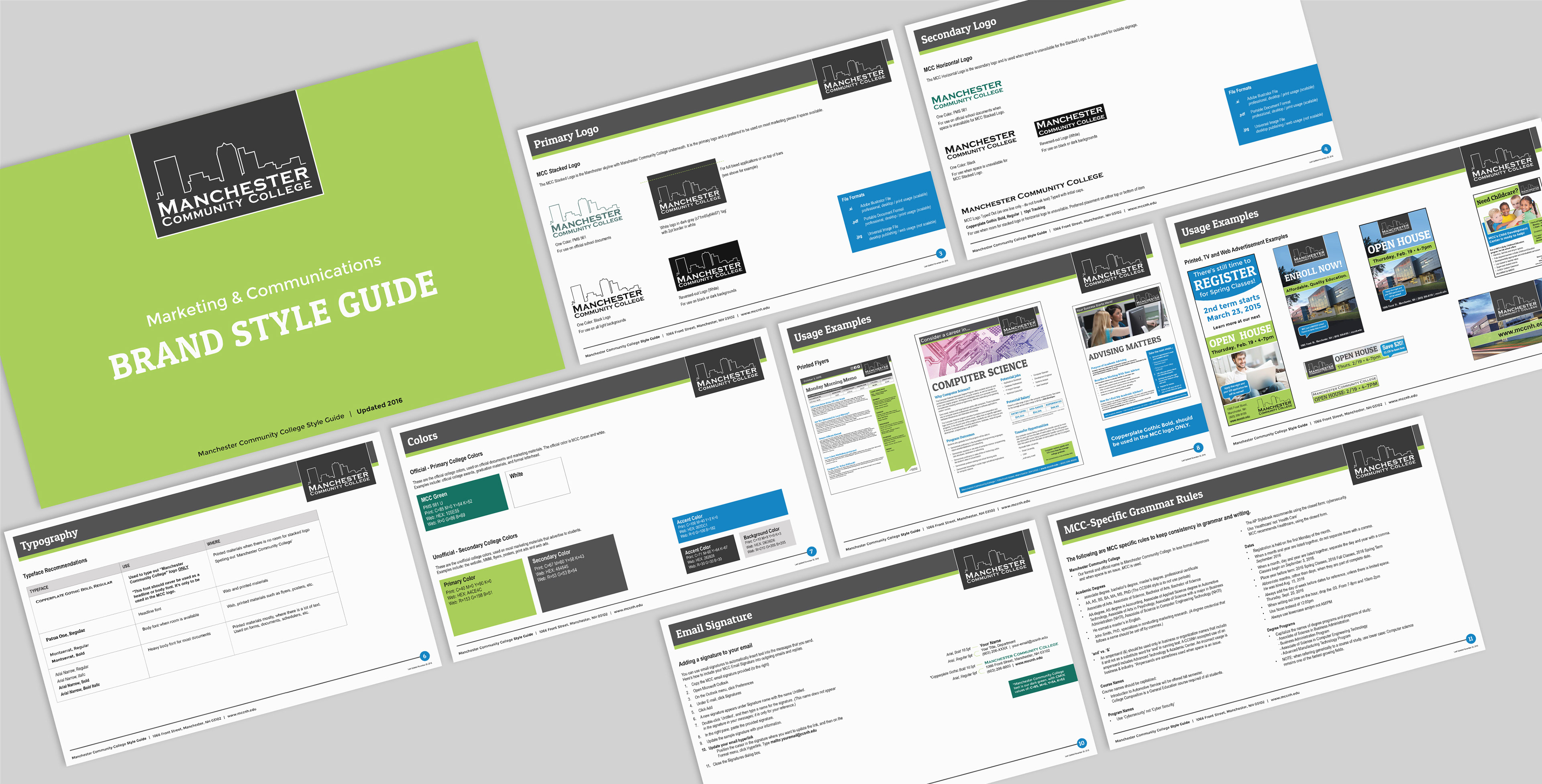
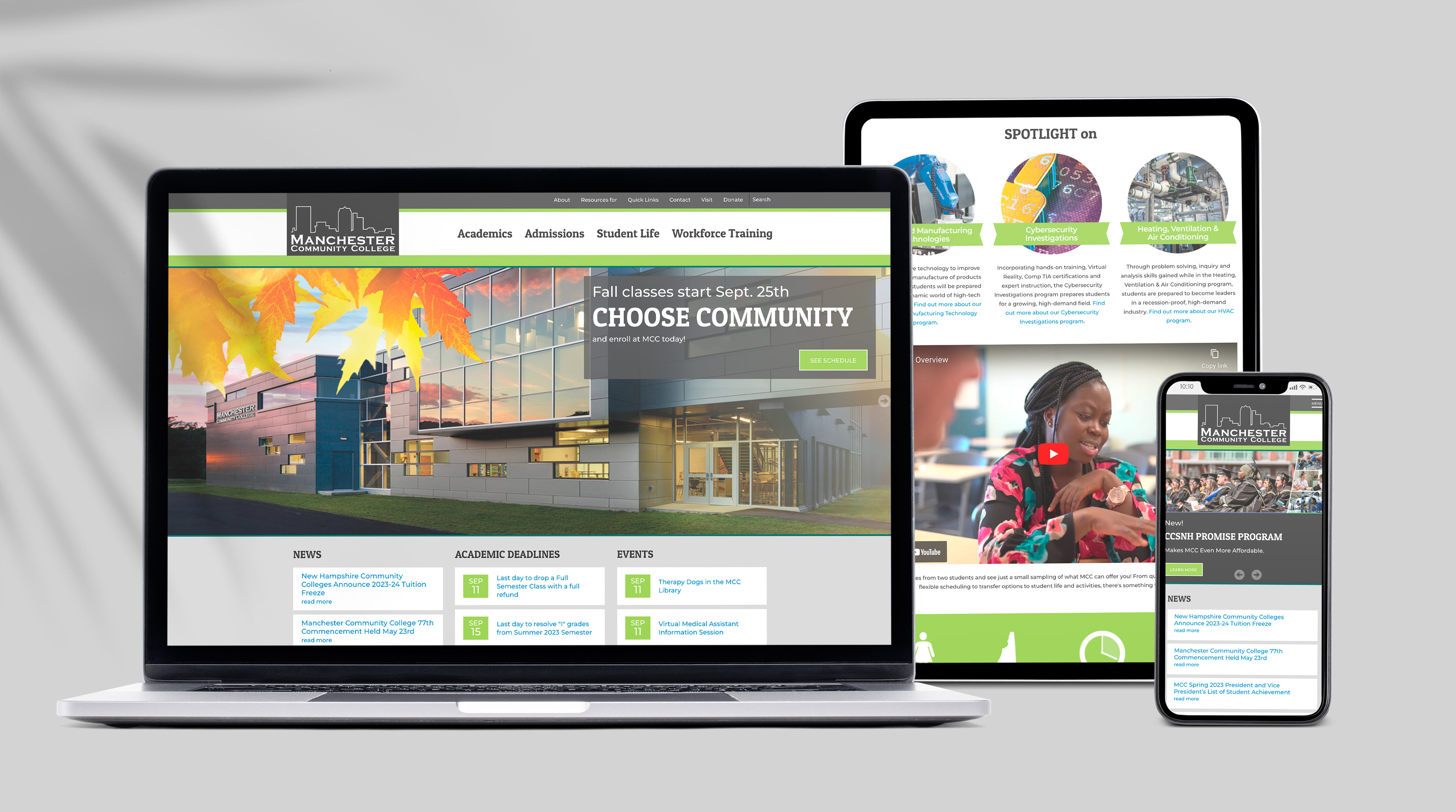
Solution: We began by developing a new style guide that reflected the college's updated brand identity. The style guide included guidelines for typography, color palette, imagery, and overall tone and voice. Once the style guide was in place, we began redesigning the website. The new website is responsive and features a clean, modern design. It is also easier to navigate and includes more engaging content.
Results: The new website and style guide have been well-received by the college community. The website has seen a significant increase in traffic and enrollment has also increased. The college is now better able to communicate with its target audience and promote its brand.
Fun Fact: The previous Marketing Director initially deemed the website acceptable, but it was the persistence and vision of my colleague and me that drove the push for its transformation. With the arrival of a new Marketing Director, we seized the opportunity to revisit the proposal, resulting in the project's green light. The subsequent rebrand and website update proved to be game-changers, yielding significant increases in both enrollment and web traffic.
My Role: Creative Direction / Lead Designer – research, conceptualization, design and layout, style guide development and launch.
Attributions: Web development and technical wizardry done by Justin Herrin.

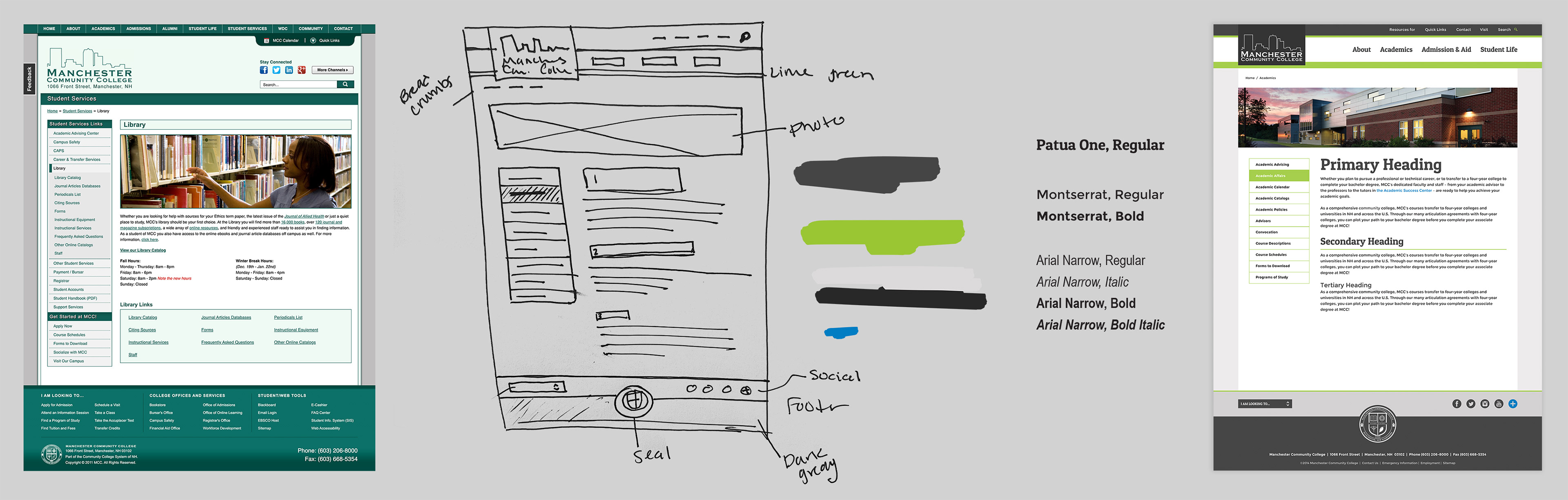
Original web design for home page and secondary pages, process sketches, new web design